skip to main | skip to sidebar

Darrell's Map Catalog

Thursday, August 7, 2008

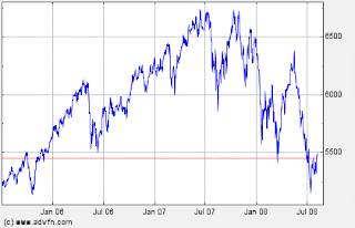
Index Value Plot


An index value plot gauges index values instead of absolute values. In this case, the FTSE trading index - an average value of selected assets over the course of two years. Tough economic times of late, indeed.

web site: -
http://www.advfn.com/p.php?pid=qkchart&symbol=FT%5EUKX
Posted by Darrell Edmunds at 8:15 AM

No comments:

Post a Comment

Newer Post Older Post Home
Subscribe to: Post Comments (Atom)

Blog Archive

  • ▼  2008 (42)
    • ▼  August (41)
      • Mental Map
      • Pie Chart
      • 3D Parallel Coordinate Graph
      • Lorenz Curve
      • Isoline Map
      • Climograph
      • Box Plot
      • Hypsometric map
      • Triangular plot
      • Web Site Map
      • Star Plots
      • Stem and Leaf Plot
      • Scatterplot
      • Radar Map
      • Sonar map
      • Lidar Map
      • Interactive map
      • Inglehart Values Map
      • Dot Density Map
      • Continuous Proportional Circle Map
      • Range-graded Proportional Circle Map
      • Bathymetric map
      • Isobars
      • Satellite Infrared Photo
      • Aerial Black & White Photo
      • Infrared Aerial Photo
      • Histogram
      • Wind Rose
      • Standardized choropleth map
      • Unstandardized Choropleth map
      • Cadastral map
      • Population pyramid
      • Topographic map - DRG
      • Nominal Thematic Map
      • Index Value Plot
      • Nominal Planimetric Map
      • Digital Satellite Image Map
      • Propaganda Map
      • Cartogram - World Immigration
      • Bilateral Graph
      • Doppler Map
    • ►  June (1)

About Me

Darrell Edmunds
View my complete profile