skip to main | skip to sidebar

Darrell's Map Catalog

Friday, August 8, 2008

Pie Chart


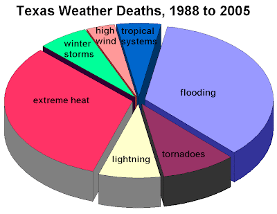
Pie Charts are some of the first forms of geovisualization to be developed. They are divided into sectors, illustrating relative magnitudes or frequencies or percents.


This chart shows the cause of weather-related deaths in Texas from 1988 to 2005.

web site - http://www.srh.noaa.gov/lub/images/safety/swaw/tx-deaths-1988-2005-wx-pie-graph.gif


Posted by Darrell Edmunds at 6:17 PM

No comments:

Post a Comment

Newer Post Older Post Home
Subscribe to: Post Comments (Atom)

Blog Archive

  • ▼  2008 (42)
    • ▼  August (41)
      • Mental Map
      • Pie Chart
      • 3D Parallel Coordinate Graph
      • Lorenz Curve
      • Isoline Map
      • Climograph
      • Box Plot
      • Hypsometric map
      • Triangular plot
      • Web Site Map
      • Star Plots
      • Stem and Leaf Plot
      • Scatterplot
      • Radar Map
      • Sonar map
      • Lidar Map
      • Interactive map
      • Inglehart Values Map
      • Dot Density Map
      • Continuous Proportional Circle Map
      • Range-graded Proportional Circle Map
      • Bathymetric map
      • Isobars
      • Satellite Infrared Photo
      • Aerial Black & White Photo
      • Infrared Aerial Photo
      • Histogram
      • Wind Rose
      • Standardized choropleth map
      • Unstandardized Choropleth map
      • Cadastral map
      • Population pyramid
      • Topographic map - DRG
      • Nominal Thematic Map
      • Index Value Plot
      • Nominal Planimetric Map
      • Digital Satellite Image Map
      • Propaganda Map
      • Cartogram - World Immigration
      • Bilateral Graph
      • Doppler Map
    • ►  June (1)

About Me

Darrell Edmunds
View my complete profile