
Friday, August 8, 2008
Mental Map

Pie Chart
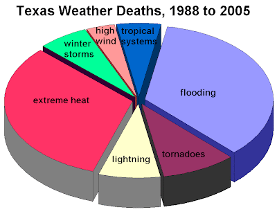
Pie Charts are some of the first forms of geovisualization to be developed. They are divided into sectors, illustrating relative magnitudes or frequencies or percents.
This chart shows the cause of weather-related deaths in Texas from 1988 to 2005.
web site - http://www.srh.noaa.gov/lub/images/safety/swaw/tx-deaths-1988-2005-wx-pie-graph.gif
3D Parallel Coordinate Graph
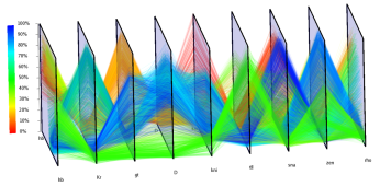
A parallel coordinate graph is used to plot large multivariate datasets.
Lorenz Curve
Isoline Map
Climograph
Box Plot
Hypsometric map
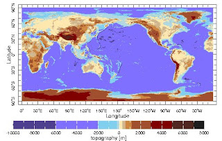
A hypsometric map is a suface map which also shows relief. It can also show any
other variable that describes a phenomena or process superimposed on
the surface (This is the equirectangular projection or Plate Carree projection).
web site - http://www.ilstu.edu/~jrcarter/LDEO/Geo201maps.htm
Triangular plot
Web Site Map

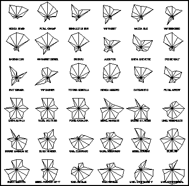
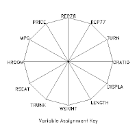
Star Plots
Stem and Leaf Plot

Maps don't have to be geographical representations of space.
A stem-and-leaf plot is a display that organizes numerical data to show its shape and distribution.
web site -http://math.albany.edu/~reinhold/m308/Assgnmt1_HowTo.htm
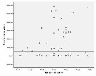
Scatterplot
Radar Map
Sonar map
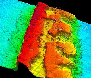
Sonar uses the emission of sound waves in water and the resulting movement of that energy to detect spatial parameters.
This is a high-definition sonar map of some of the shelf-edge reef habitat off South Carolina from the SC Dept. of Natural Resources.
web site - http://www.dnr.sc.gov/news/Yr2006/oct23/oct23_maps_pic.html.
Lidar Map
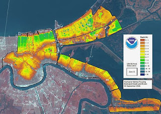
Lidar (light detection and ranging) is a form of airborne remote sensing which, according to our class notes, "uses a laser (light amplification by stimulated emission of radiation) instead of radio or microwave radiation."
This lidar map of New Orleans helped rescue crews and other emergency officals get a sense of the destruction left in the aftermath of Hurricane Katrina.
web site - http://flickr.com/photos/81876992@N00/43339456/
Interactive map
 An interactive map is usually a program that allows the user to display various data on a given spatial representation.
This particular map is from http://www.saferoadmaps.org/maps/index.htm and displays instances of speeding by underage drivers in 2006.
Inglehart Values Map
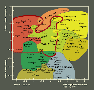
This an Inglehart Values Map, which visualizes the strong correlation of values in different cultures. Countries are clustered according to how religious/secular they are and what particular sect its citizens practice.
web site - http://www.worldvaluessurvey.com/library/set_illustrations.html
Thursday, August 7, 2008
Dot Density Map
Continuous Proportional Circle Map
Range-graded Proportional Circle Map
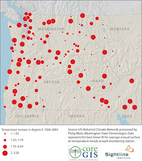
Bathymetric map
Isobars
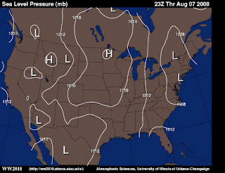
This is an isobaric (air pressure) weather map. The lines (contours) signify areas of common pressure. High pressure areas are usually clear while low pressure areas bring wind and precipitation. Lines that are close together mean strong winds.
web site - http://ww2010.atmos.uiuc.edu/(Gh)/wx/cwp/prods/current/sfcslp/sfcslp_N.gif
Satellite Infrared Photo
Aerial Black & White Photo
Infrared Aerial Photo
Histogram
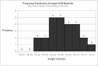 A histogram is a graphical display of tabulated frequencies. In this case, what's being tabulated is the frequency of distribution of height among students in one class.
web site - http://www.math.kent.edu/~honli/teaching/statistics/Chapter2/Excell_Histogram.html
Wind Rose
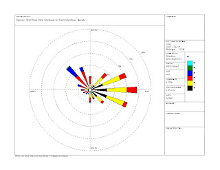
This one is for Yucca Mountain, Nevada - and communicates where radiation could spread if there were a worst-case scenario contamination at a proposed nuclear waste reserve.
web site - http://www.state.nv.us/nucwaste/trans/rwma0108.pdf
Standardized choropleth map
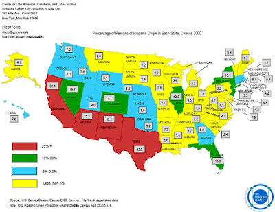
This particular map shows the percentage of Persons of Hispanic Origin in each state in the year 2000.
Choropleth maps are either standardized or unstandardized depending on whether the data has been areally averaged.
This is a standardized map because the data is relativized to a commom denomenator (percentage).
web site: http://www.sitemaker.umich.edu/356.haas/files/us_map.jpg
Unstandardized Choropleth map
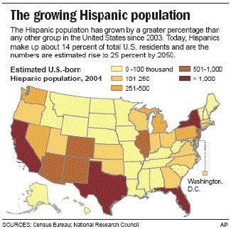 This is an unstandardized choropleth map. The variables here are not areally averaged, which makes it look much different that if it were, let's say, U.S.-born Hispanic citizens per square mile (population density).
The map is from the U.S. Census Bureau, but was actually cited in an article about a Wal-Mart opening its first 'Hispanic Community' store.
web site - http://naturalspecialtyfoodsmemo.blogspot.com/2008/05/ethnic-retailing-memo-wal-mart-to-open.html
Cadastral map
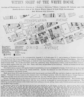
A Cadastral map is one one which an area is partitioned by one of several systems (metes and bounds or PLSS, for example).
This one is entitled, "Within sight of the White House : section of Washington, D.C., known as "Hooker's Division," which contains 50 saloons and 109 bawdy-houses--list of 61 places where liquor is sold with government [sic] but without city licenses."
web site: http://www.ushistoricalarchive.com/statemaps/dc/32.html
Population pyramid
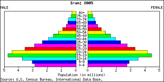
A population pyramid is a graphical representation - a data visualization - of a given group of people's age.
This one, a cross-section of Iran's population age, suggests that the nation is relatively very young. The vast majority are under 30 years old.
web site: http://www.nationmaster.com/country/ir/Age_distribution
Topographic map - DRG
digital raster graphic - a scanned image of a U.S. Geological
Survey (USGS) standard series topographic map
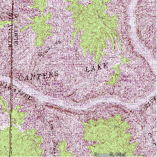 .
.A topographic map has contour lines which represent elevation and relief of an area. This one is of Carter Lake, GA, where a group of friends and I recently went camping.
web site: http://ga-ims.er.usgs.gov/website/drg24/viewer.htm
Nominal Thematic Map
Index Value Plot
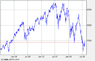
An index value plot gauges index values instead of absolute values. In this case, the FTSE trading index - an average value of selected assets over the course of two years. Tough economic times of late, indeed.
web site: -
http://www.advfn.com/p.php?pid=qkchart&symbol=FT%5EUKX
Wednesday, August 6, 2008
Nominal Planimetric Map
Digital Satellite Image Map
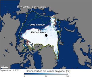
Propaganda Map
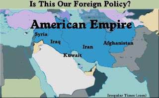 A propaganda map is used in order to influence opinion - regardless of whether that map is accurate or intentionally misleading.
This one came from a blog entitled IrregularTimes.com in which the writer postulates on the endgame of the Bush Administration's Middle East foreign policy.
web site: http://irregulartimes.com/empiregeography.html
Cartogram - World Immigration
A cartogram is a data visualization in which the magnitude of a given variable is represented by re-shaping the map itself.
This map is a cartogram of world net immigration. The larger countries recieve the most immigrants. There's also a propaganda element here; the map was found on a conservative news site in belgium - and a marxist blog.


